Auria’s
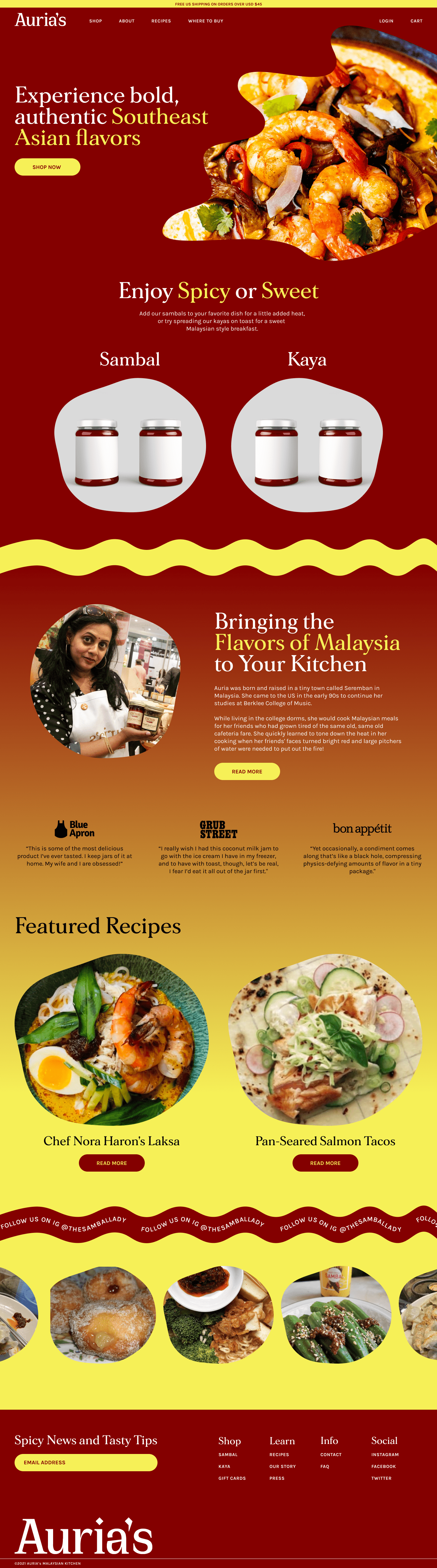
Auria’s is a brand of Malaysian-inspired pantry staples. As a self-initiated project, I rebranded their business and redesigned the desktop layout of their website.
The updated logotype features angular letterforms and sharp serifs that suggest the bold, spicy flavors present in Auria’s popular hot chili sambal.
The web design makes extensive use of the brand’s deep red and bright yellow. These colors are reminiscent of the vibrant, spicy flavors present in many of the pantry items and even reflect the colors of the products themselves in some cases. Wavy textures, gradients, and amorphous shapes lend a fun and whimsical feel to the site and offset the more high contrast effects of the typography and color palette.