Zia Pia
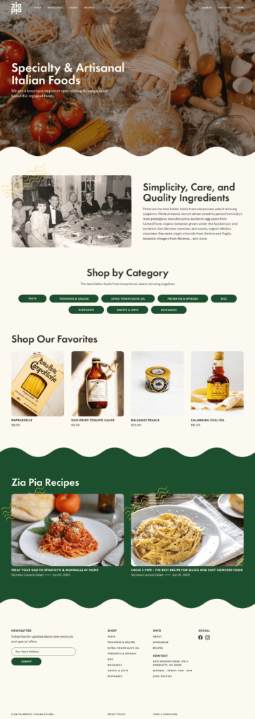
Zia Pia is a boutique Italian food importer. As a self-initiated project, I rebranded their business and redesigned the desktop layout of their website.
The logo features round, geometric letterforms with the two instances of the letter “i” positioned to avoid redundancy and imply symmetry and reflection. The lower letter “i” performs a second function by imitating an exclamation point which further underscores the sense of exuberance inherent in Italian food and culture.
The web design extends the playful, vibrant feel of the brand and makes reference to the tortuous shapes that can be seen in certain shapes of pasta.