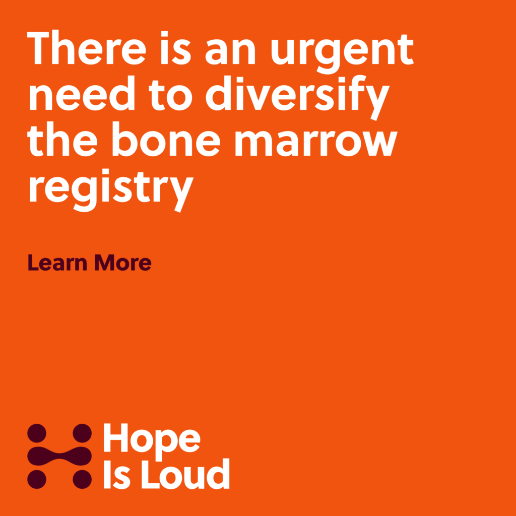
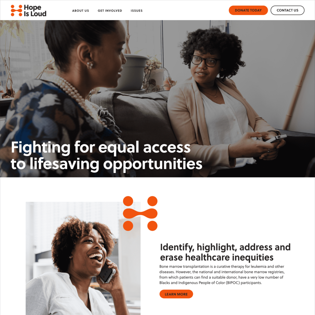
Hope is Loud is a nonprofit that seeks to raise awareness about health inequities that affect BIPOC communities with an initial focus on improving chances of finding a donor for patients needing a bone marrow transplant. As Hope Is Loud began to grow, it became clear that a brand identity was needed to help the organization move forward. I provided brand strategy guidance and designed a visual identity that speaks to the organization’s unique focus and positioning.
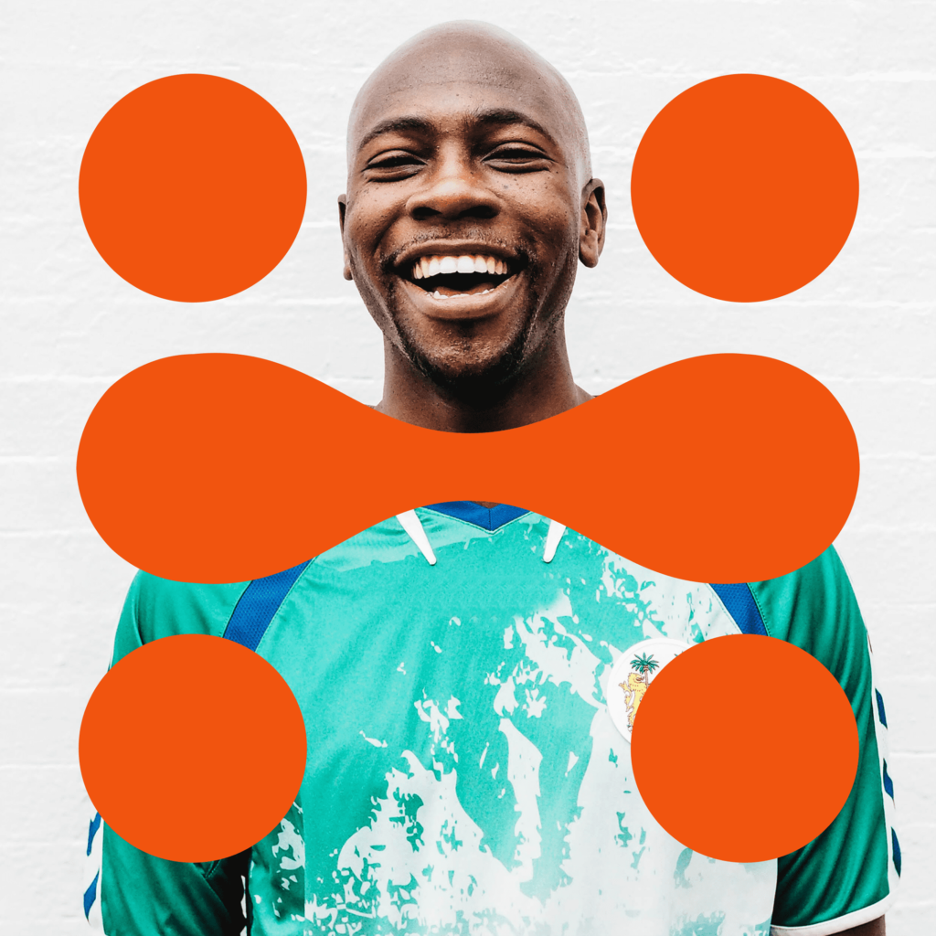
The logotype appears friendly while also professional and trustworthy. The shapes of the mark and their placement suggest people which reinforces the idea that people are at the core of Hope Is Loud’s mission and vision. The shapes merge in a way that promotes the idea of coming together, exchanging ideas, and connecting in a beneficial way.
The connections within the mark are also reminiscent of blood drops which symbolize health as well as Hope Is Loud’s focus on improving blood cancer survival rates among BIPOC. Lastly, the various shapes combine to form an “H” which refers back to the brand name, helping the user connect the mark with the name.
The color palette makes use of bright, bold colors that speak to the urgency and passion associated with Hope Is Loud’s spirit of activism. This allows Hope Is Loud to stand apart from some of their more staid contemporaries in the healthcare nonprofit space.