Brand Identity Digital Motion Web 

Exploring Vegan

FEATURES: Typewolf, MaxiBestOf, Design Shack, Fonts In Use

Exploring Vegan was founded on one principle: eating plant-based doesn’t have to be an all-or-nothing affair. The hope was to create a brand that exudes joy, excitement, and exploration of new, tasty ways to incorporate meat-free meals into everyday life, whether it’s once a week or every meal.

It was of utmost importance for the brand to reflect the fun and playful nature of exploration. The logo features loops and curls that mimic plant growth and hint at the many different directions and paths that plant-based cooking can take. Extensive use of bright colors inspired by plants, fruits, and vegetables add a sense of vibrancy to the brand and are supported by sticker-like illustrations and carefully considered photo backdrops. Lastly, typographic selections were chosen to emphasize the welcoming mindset of Exploring Vegan while also adding a bit of quirk.

For the web experience, a variety of animations and microinteractions keep the user engaged and create a joyful digital experience. Prominent discoverability elements allow the user to take their own journey through the world of plant-based recipes and product reviews. view live site here.

Learn More +

Brand Identity Digital 

ChargingRewards

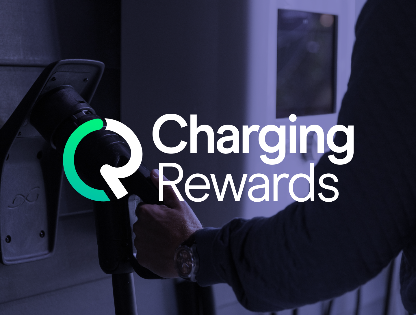
ChargingRewards is an app that allows electric vehicle drivers to save money on their utilities by signing on to charge their vehicle in off-peak hours. To every current and future EV driver, ChargingRewards is the link to their electricity provider that enables them to earn rewards and create a smarter electric grid. I collaborated with marketing strategists at Scaledigital to design a brand identity that would set ChargingRewards apart in the market and resonate with both electric vehicle owners and energy providers.

After reviewing Scaledigital’s background and research findings, I created a set of concept boards to survey a range of visual approaches that could serve as jumping-off points for the ChargingRewards visual identity. Once a visual direction was chosen, I began exploring options for the ChargingRewards logo. I eventually narrowed down my options to three concepts that each highlighted slightly different aspects of the ChargingRewards brand.

The chosen concept links the imagery of the charge on an EV battery indicator with the “C” and “R” of the brand name. The mark combines smooth and circular forms with a more angular anchoring point that can be found at the bottom of the “R”. The letterforms in the text are round and friendly while also structured and professional. The color palette is bright with a green accent that implies a charging battery as well as saved money.

After completion of the logo, type styles and color palette were finalized, and additional assets such as icons and a web hero were designed for the client.

Learn More +
Brand Identity 

Hope is Loud

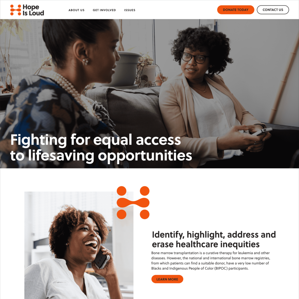
Hope is Loud is a nonprofit that seeks to raise awareness about health inequities that affect BIPOC communities with an initial focus on improving chances of finding a donor for patients needing a bone marrow transplant. As Hope Is Loud began to grow, it became clear that a brand identity was needed to help the organization move forward. I provided brand strategy guidance and designed a visual identity that speaks to the organization’s unique focus and positioning.

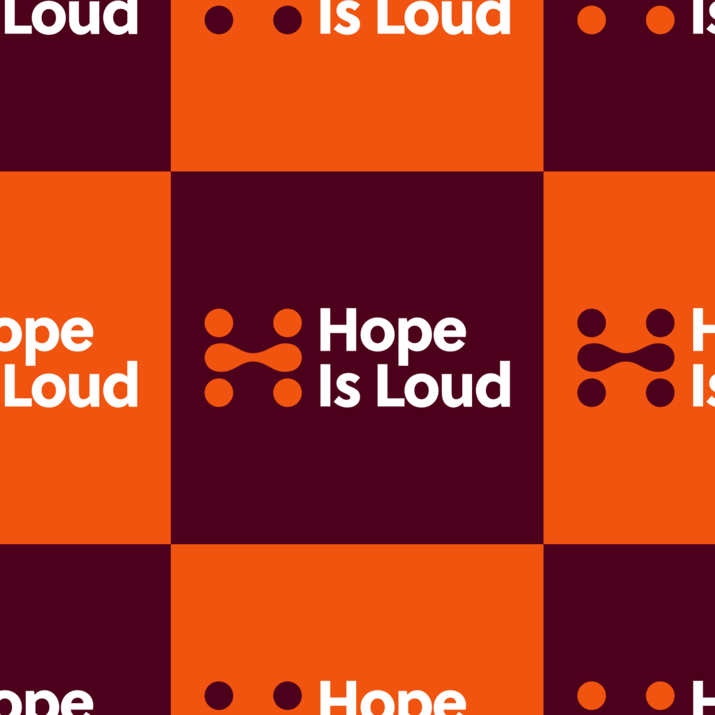
The logotype appears friendly while also professional and trustworthy. The shapes of the mark and their placement suggest people which reinforces the idea that people are at the core of Hope Is Loud’s mission and vision. The shapes merge in a way that promotes the idea of coming together, exchanging ideas, and connecting in a beneficial way.

The connections within the mark are also reminiscent of blood drops which symbolize health as well as Hope Is Loud’s focus on improving blood cancer survival rates among BIPOC. Lastly, the various shapes combine to form an “H” which refers back to the brand name, helping the user connect the mark with the name.

The color palette makes use of bright, bold colors that speak to the urgency and passion associated with Hope Is Loud’s spirit of activism. This allows Hope Is Loud to stand apart from some of their more staid contemporaries in the healthcare nonprofit space.

Learn More +
Brand Identity 

Community Access Naperville

Community Access Naperville (CAN) is an organization in Illinois working to empower people with intellectual and developmental disabilities to work in, contribute to, and enjoy their community. An updated brand identity was needed to help CAN move successfully into the organization’s next chapter as it looks to expand its offerings and impact on the community.

I developed three concepts to highlight different aspects of CAN’s community-based work. The first concept seeks to emphasize connectivity within the organization in a friendly and welcoming manner. The second concept highlights the professional and action-oriented nature of the organization with a structured mark and a bright palette. Lastly, the third concept highlights the more playful and fun aspects of the organization and emphasizes the diversity, particularly neurodiversity, of those involved with a variety of colors and shapes.

Learn More +

Concept 1

Concept 2

Concept 3